Category
App Design - Mobile Banking
Role
Lead Visual | UI Designer
Client
H&R Block | Spruce
- Introduce Emerald Advance within the MyBlock App
- Display the process for applying, processing and accepting the loan
- Notify and inform the user throughout the process
- Scale the Block Design System to accommodate for new patterns and controls
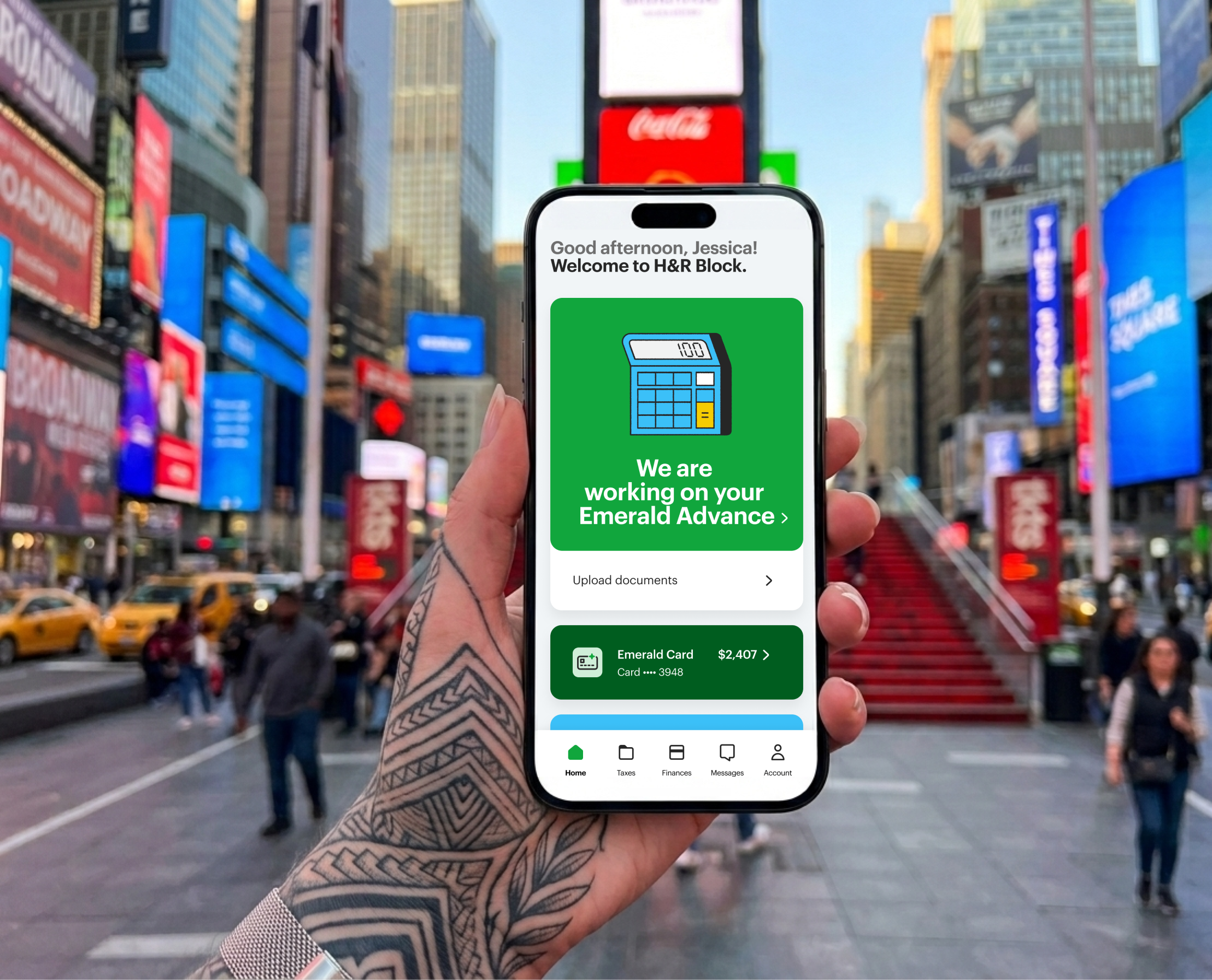
H&R Block customers interested in receiving an advance on their tax return. They can complete the Emerald Advance process within the MyBlock app without having to visit a physical location.
The Emerald Advance card within the MyBlock Home Screen launches the Emerald Advance flow. The flow is organized with a set of tasks displayed within a progress indicator estimating the time required for each task. The size and weight of the H1’s, card based layout and clear system feedback create an easy and obvious flow.
Emerald Advance Status Card
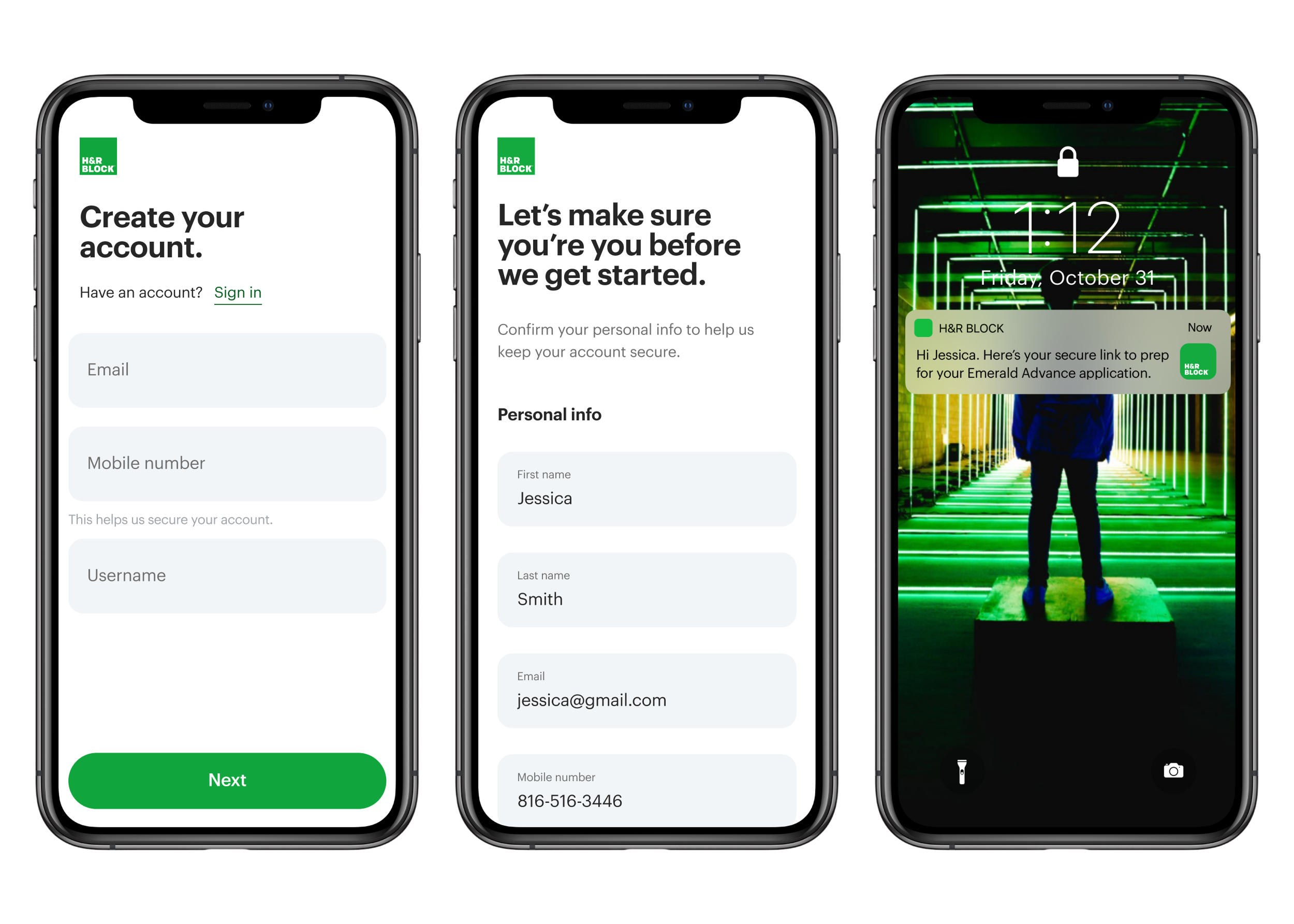
After the user has created an account or signed into the app the hero card will display the Emerald Advance Program. The user can access the Emerald Advance flow from the hero card. The hero card will also display the loan status and direct the user through the application process.
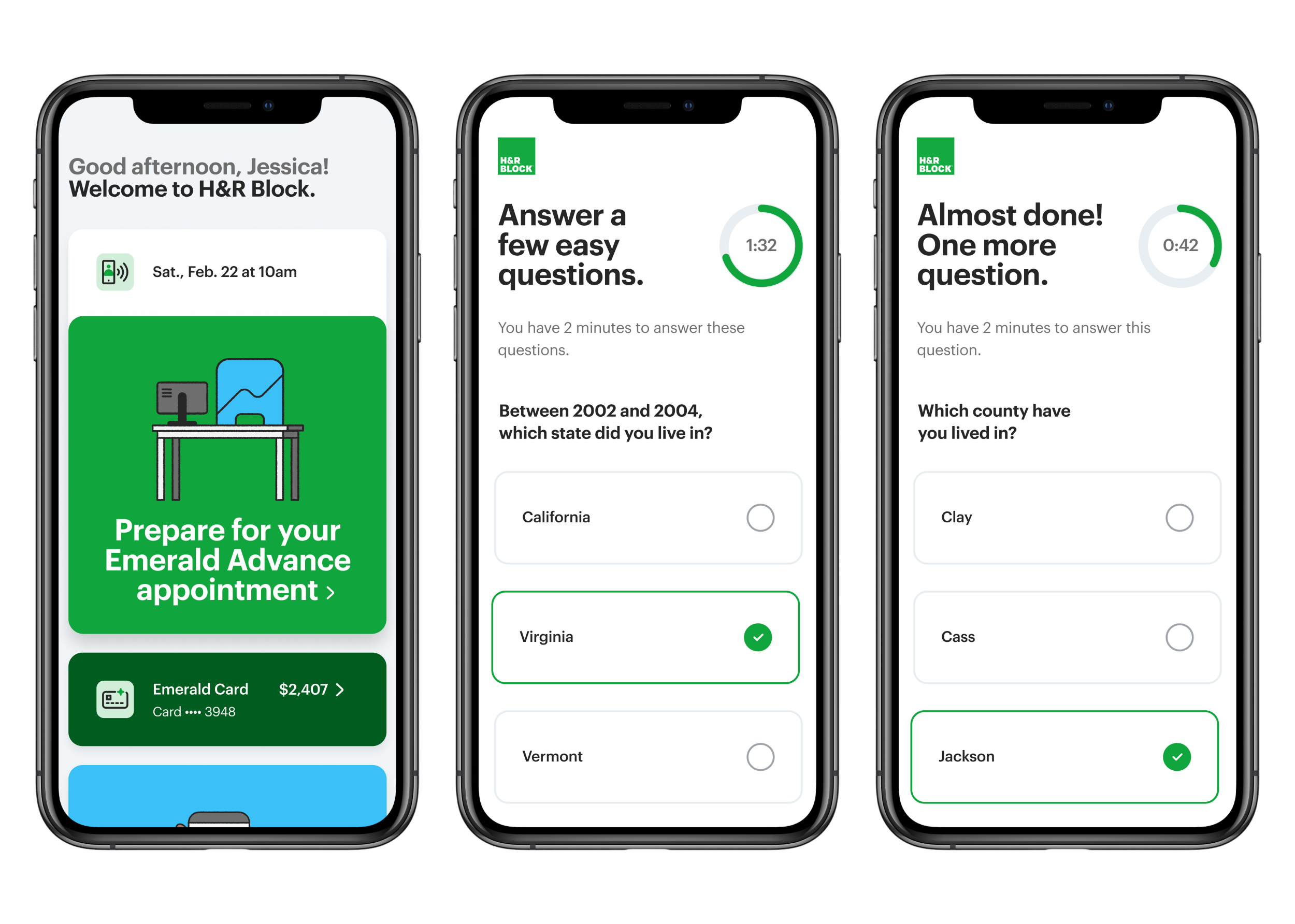
Loan Progress Indicator
The loan progress indicator is persistent and prominent within the Emerald Advance flow and tracks the steps of the application process. Certain steps of the process are timed with retry limits for security purposes. The Emerald Advance hero card displays the users position in the process and directs them to the next step.
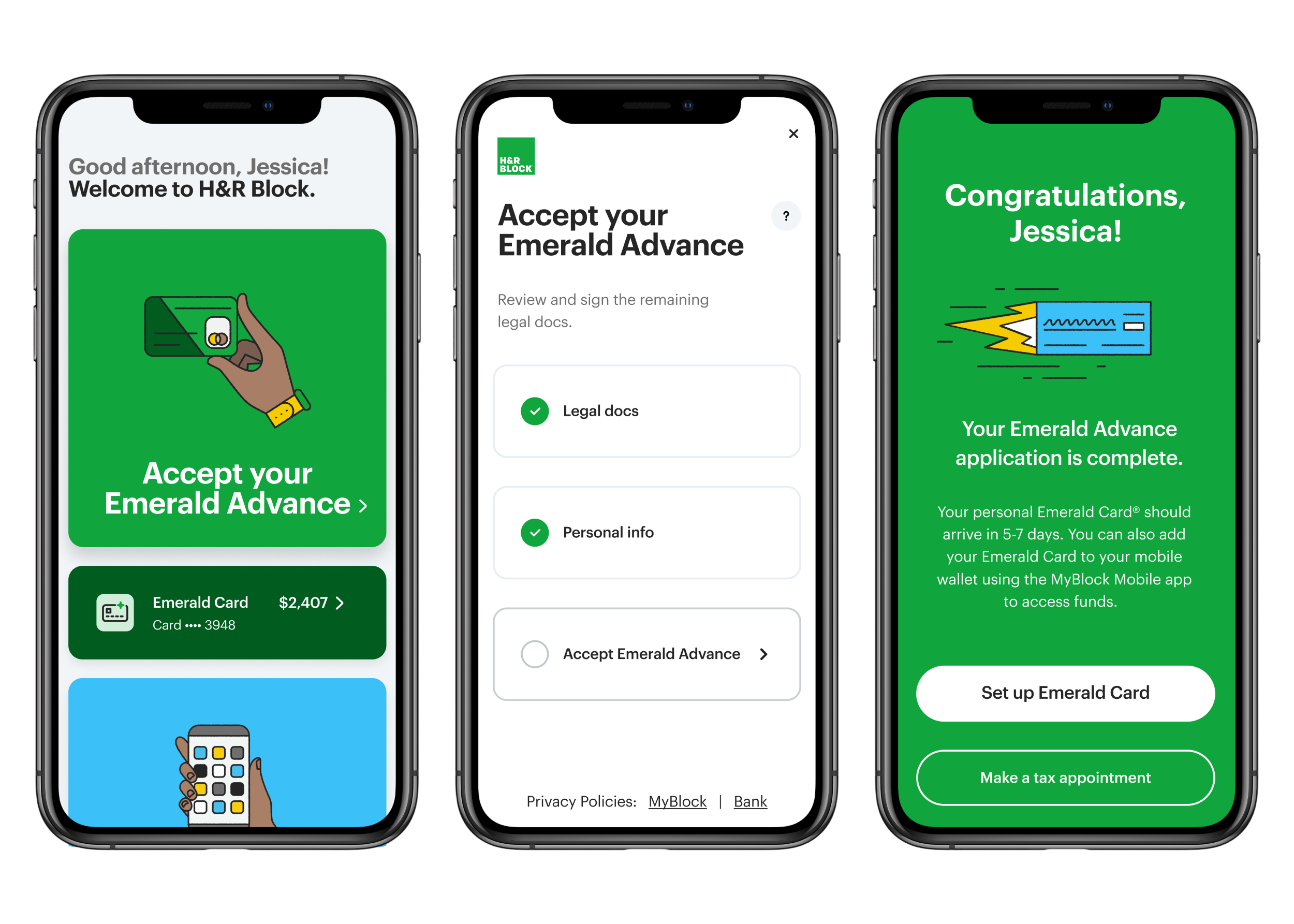
Loan Acceptance
After the Emerald Advance application has been processed the user will be notified that the loan is available and they can access it through their personal Emerald Card. The Emerald Advance hero card lets the user know that their Emerald Advance is available.
General
The visual language is defined by The Block Design System which was designed by Work & Co. The design system required scaling to accommodate the new Emerald Advance flow. The additions to the visual language were carefully considered and tested before being approved by a stakeholder governance model and included in the Block Design System.
Color
Brand accents were used as the primary color within the Emerald Advance flow. These were selected to differentiate the loan offering while complimenting the Block primary green.
Imagery
The iconography within the MyBlock app and Emerald Advance flow is modern, organic and uniquely human. The iconography is used to imbue the app with levity and humanity.
The Emerald Advance interaction framework is aligned with and a continuation of the motion design established within the MyBlock app. Large decisions are represented with prominent motion and ancillary actions with micro-interactions.
+71%
Loan Applications
+36%
Loan Approvals
+19%
User Acquisition
“Emerald Advance being available through the MyBlock app was a game changer. The success of this program in the digital space is historic for H&R Block.”
Visual Design, UI/UX Design, Motion Design and Creative Direction.
Pen and paper for ideation. Figma for design and prototyping.
- Provide a home for the unbanked
- Improve Americans financial health
- Provide fair, friendly, and progressive financial options for everyone
- Vision and promise: Make your money go further so you can too
Our audience believes they’re bad with money and would like guidance to help with the principles of how to become financially healthy. Additionally, they feel that being good with money is nearly impossible because they’ve been burned by banks and bank fees in the past. This makes it difficult to stay motivational and achieve financial goals.
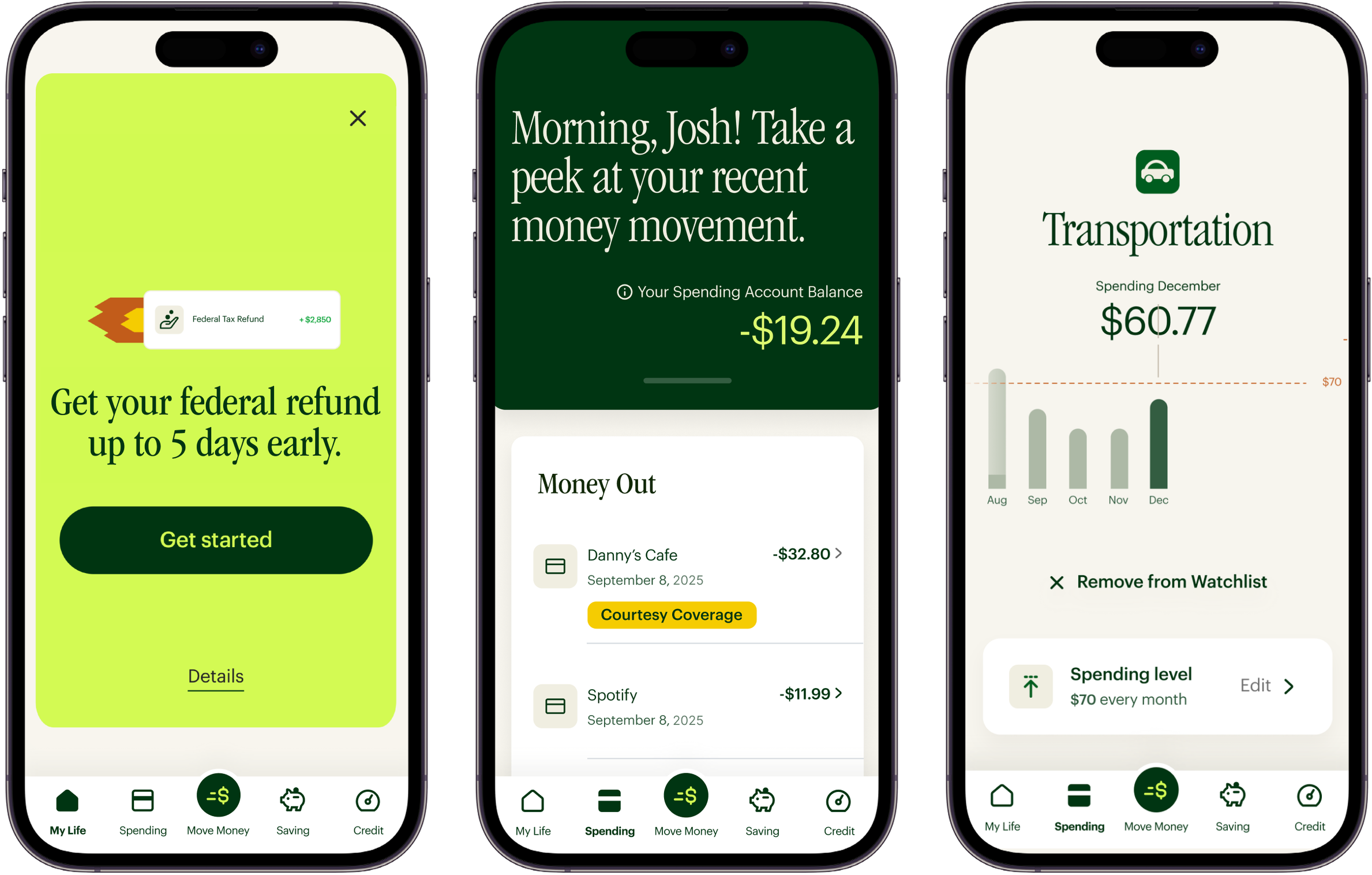
We established four pillars our features line up with based on consumer research, addressing significant unmet needs around spending, saving, borrowing and planning. We designed the following features to support these pillars; no monthly fees, early payday, cash back offers, saving goals, free credit score, courtesy overdraft coverage, tax refund recommendations, budget tracker tool and bonus offers with direct deposit.
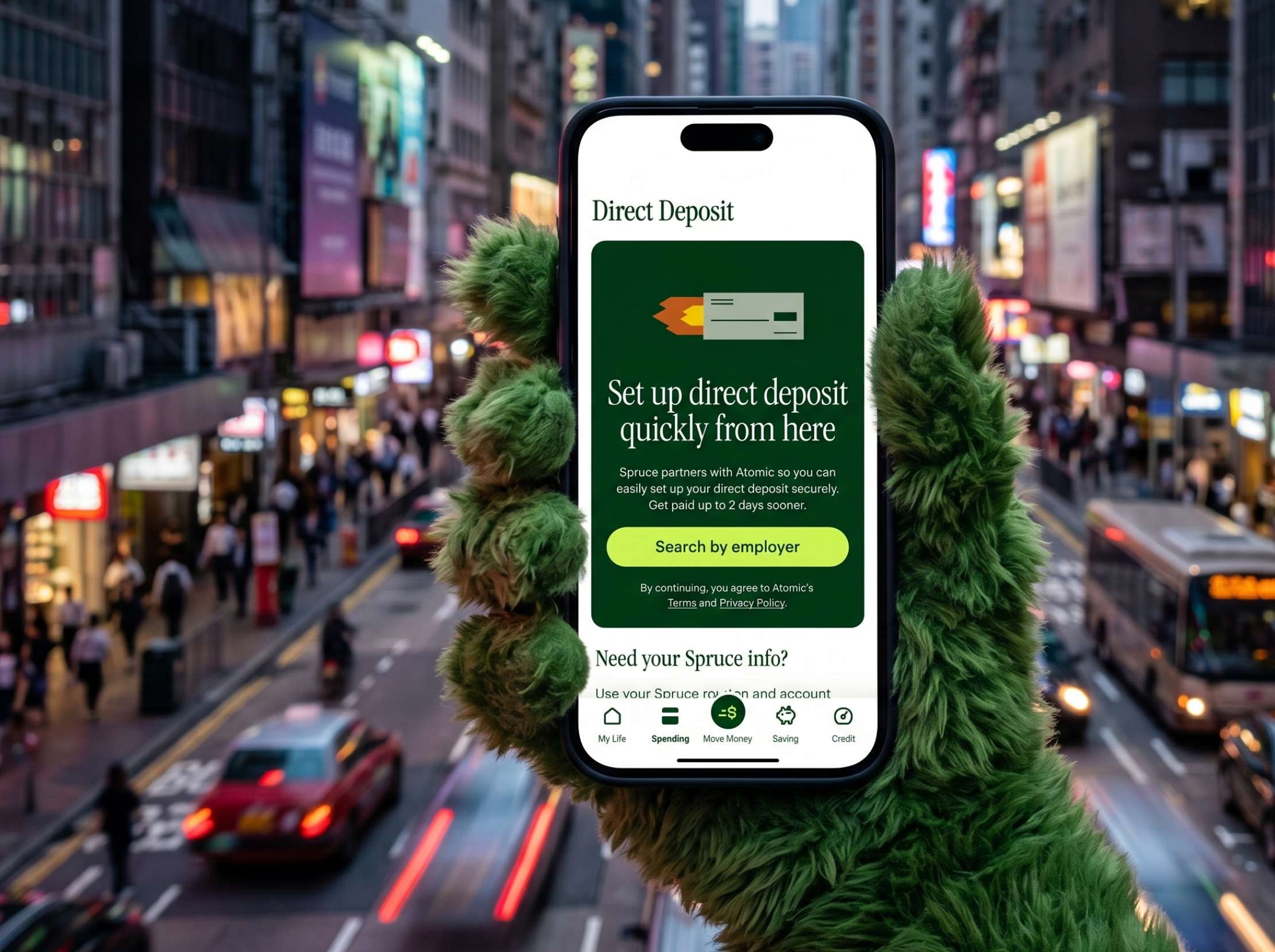
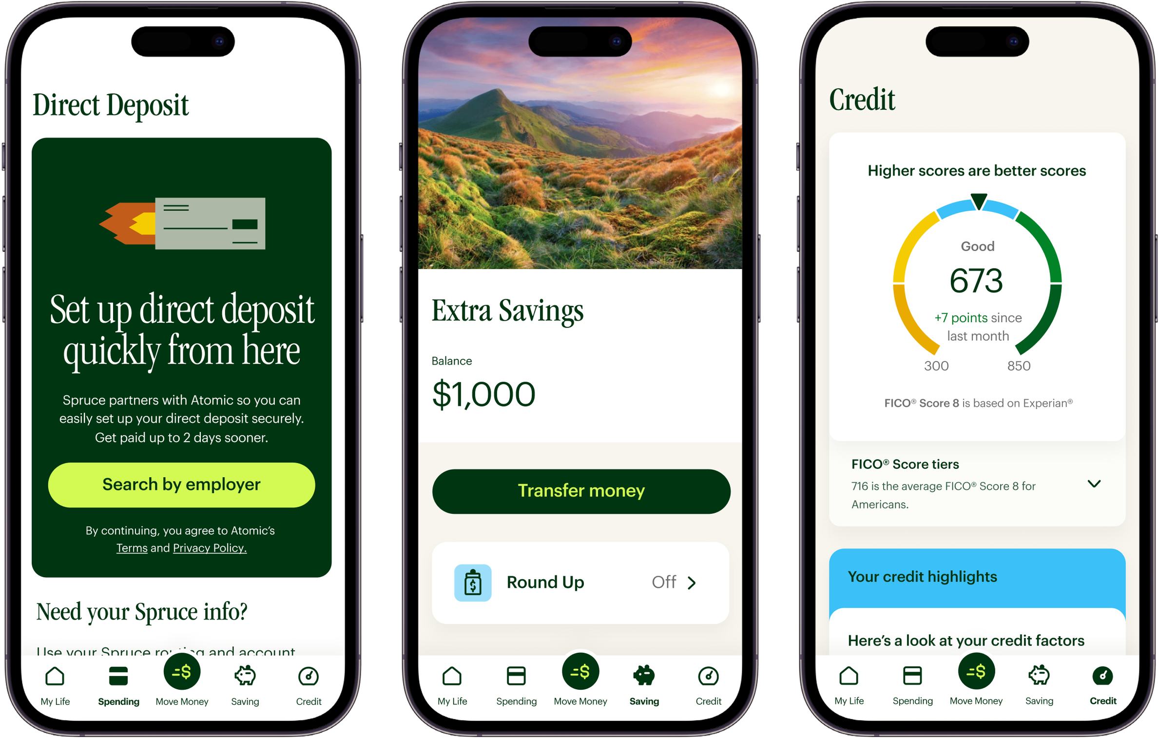
My Life & Spending
The My Life tab displays a snapshot of balances, recent transactions and proactive financial advice for the user based on their activity within the app. Inside the Spending tab the user can review debits and deposits, see all transactions and is notified of financial patterns.
Move Money, Saving, and Credit
The Move Money tab is for transfers between different accounts, the Saving tab contains tools for setting goals, activating Savings Round Ups and currently earns 3.50% APY with no minimum balance requirement. The savings tab is designed around specific savings goals rather than one specific goal. The credit tab is designed for monitoring and improving your Credit score.
Type
Typography is split by purpose: Garamond (a serif with roots in books and storytelling) is used for the logo and headlines to create a conversational tone, while Graphik, a cleaner sans-serif, handles data and information. That's a fairly unusual choice for a fintech app — most banking apps go all-sans-serif for a "neutral/trustworthy" feel — and reflects an intent to feel warmer and less clinical than a typical neobank.
Color
The color palette uses new shades of green that read as both calming and energizing, rather than reusing H&R Block's exact corporate green outright.
Imagery
Icons are single-color and shared across the H&R Block ecosystem, while illustrations carry the "expressive, emotional, narrative" layer of the brand.
The interactions are calm and subdued - designed for people who want clarity, not novelty, from their bank. The interaction language is comprised of standard, low-drama patterns: tab switches, basic load states, simple confirmation checkmarks, toasts for things like completed transfers, and toggle-style switches for opt-in features.
Spruce launched as H&R Block's first mobile banking platform, giving millions of underserved Americans a fair, friendly home for their money and the tools to build healthy financial habits.
$1.75B
Customer Deposits
50%
Non-Tax Deposits
30%
Sign-Ups Lift
"Spruce reimagined what mobile banking could be for the people who need it most — fair, friendly and built to help money go further."
Visual Design, UI/UX Design, Motion Design and Creative Direction.
Pen and paper for ideation. Figma for design and prototyping.
- Display the users earned balance on the Home Screen
- Gamify the app and earning experiences
- Display earning opportunities on the Home Screen
- Craft a polished visual language to increase clarity & trust
Young adults interested in earning extra money using their phone. They can get paid to take surveys, play games, and share data for market research.
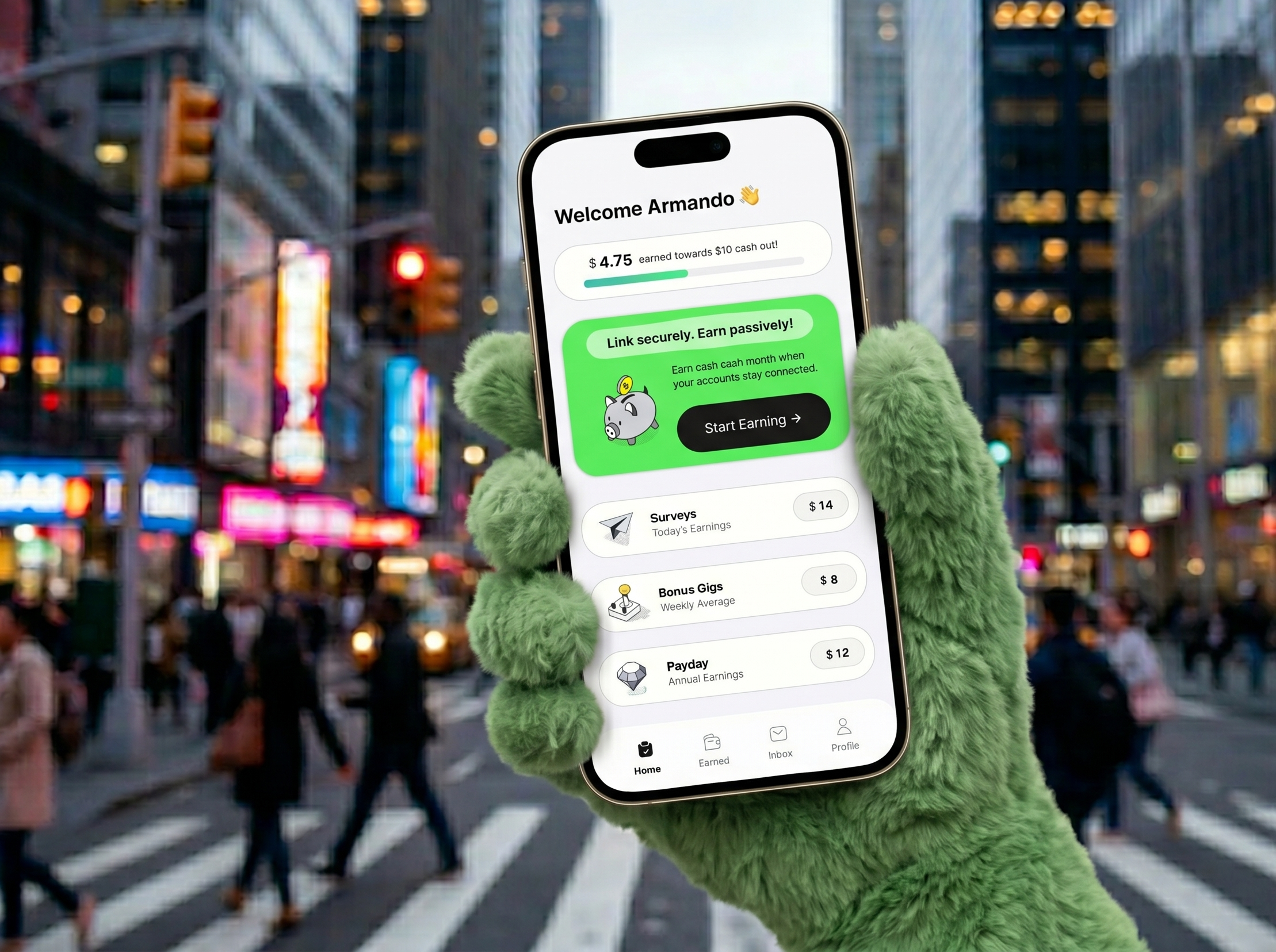
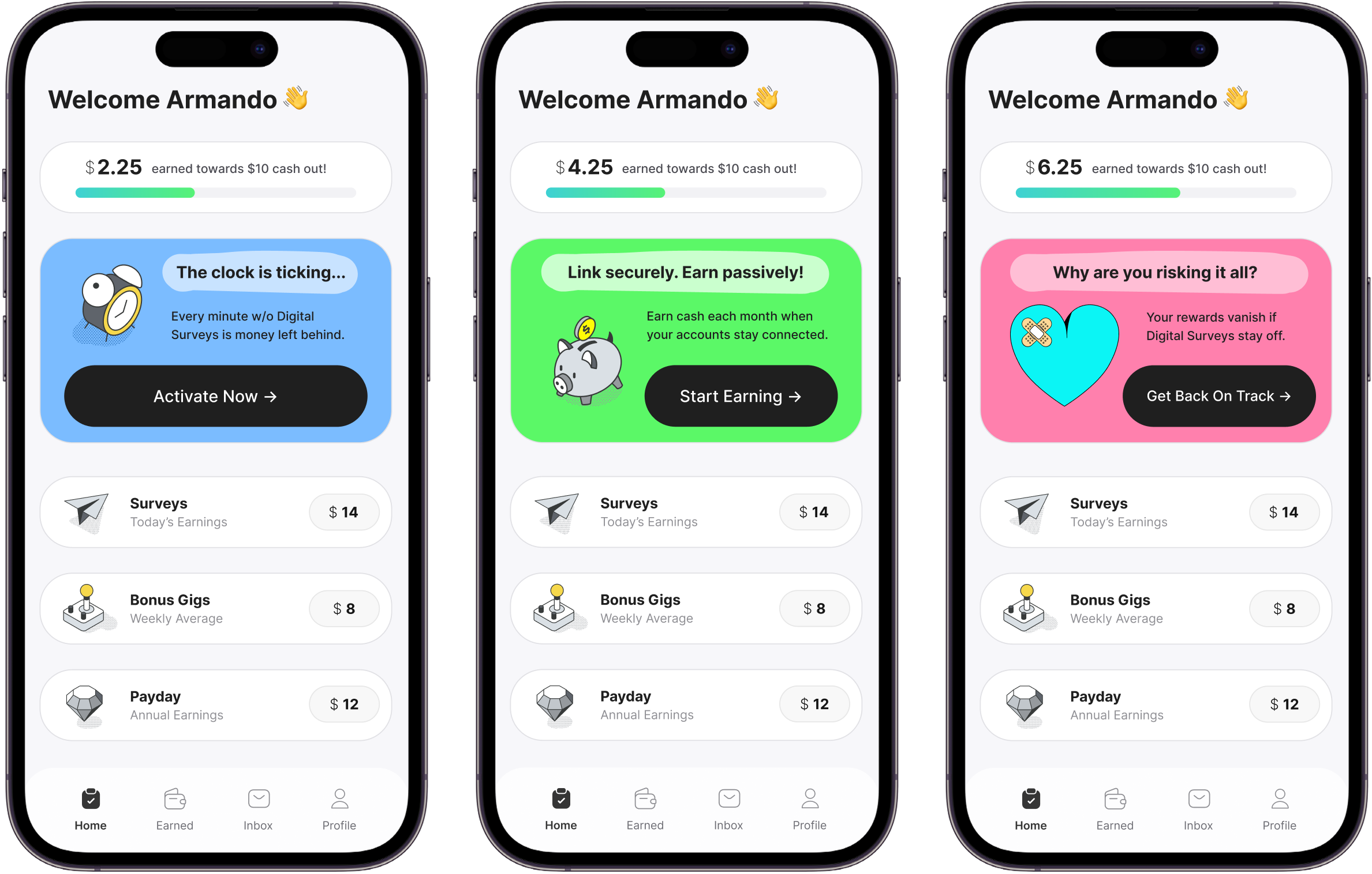
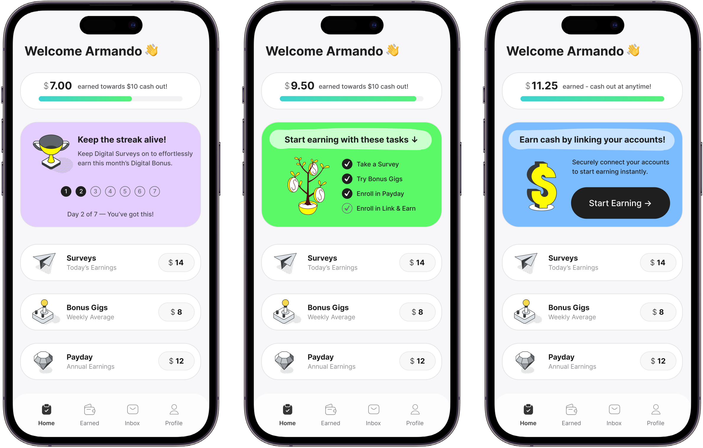
Originally the home screen of the app was organized based on the business and stakeholders goals. The business and stakeholders wanted the users to take surveys and share data so the experience started with a list view of surveys. We approached this problem by aligning the users mental model with the presentation layer of the application. The user is here for one reason - to make money. So the hierarchy of the app is focused on earning.
Home Screen
The Home Screen displays a top to bottom hierarchy starting at the top with the amount the user has earned, followed by a hero card with a CTA to maximize earnings based on activity and below that a set of mini cards that direct the user to all earning opportunities available. The typography carries the voice, isometric icons and brand color carries the feeling, and motion highlights what matters.
CTA Card
A large card dynamically displaying information and CTA’s to increase earning based on the users activity within the app. The CTA card will always inform the user of their next best step to maximize earnings. This includes custom surveys, data sharing, product testing, games and more.
Type
Inter bold for headlines paired with variants of inter at smaller sizes and weights for body and supporting copy. Medium leading, generous spacing.
Color
Brand gradient light-teal-lime for progress indicators, sky-mint for highlights and grey 900 for actions.
Imagery
Isometric icons with a splash a brand sunset, soft shadows, and generous white space.
Motion is used to direct, not to decorate. Navigation translates smoothly, cards reveal micro-details, and sections translate in gently as they enter and exit the viewport. The app feels alive without demanding attention.
The new Home Screen improved conversion and reduced friction. Surveys, Bonus Gigs and Payday all saw dramatic increases in user adoption and retention.
+40%
Bonus Gigs Users
+23%
Survey Payouts
+27%
Payday Retention
"Modern, stylish and extremely effective. The new Home Screen increased conversion and retention for all of our programs."
Product Owner, Surveys on the Go
Visual Design, UI/UX Design, Motion Design and Creative Direction.
Pen and paper for ideation. Figma for design and prototyping.


